Best SaaS Website Examples in 2026
A curated list of SaaS websites that get it right, from hero to footer, and what makes each one worth studying.

7 min read
Copy URL
Copied!
A great SaaS website does not just look good. It communicates a complex product with clarity, builds trust quickly, and guides visitors toward a decision. The best ones make that look effortless.
This is a curated list of SaaS websites we think are worth studying in 2026. Not because they follow trends, but because each one solves a real communication problem in a way that feels intentional, clear, and well-crafted.
The fundamentals
Before the list, a few patterns worth noting. The best SaaS websites tend to share a handful of qualities that set them apart.
Clarity above everything. The visitor understands what the product does within seconds. No jargon, no vague promises, no clever taglines that require interpretation. The value proposition is specific and immediate.
Product visibility. Screenshots, demos, videos, or interactive elements that show the product in action. The visitor should be able to understand what using the product looks like without signing up or booking a call.
Intentional motion and pacing. The best sites use motion to guide attention, not to decorate. Scroll-triggered animations, micro-interactions, and transitions that serve the narrative rather than distract from it.
Trust signals that feel earned. Customer logos, metrics, and testimonials that are specific and believable. One testimonial with a concrete outcome is worth more than a wall of generic praise.
Restraint. Strong sites know what to leave out. No feature dumps, no pages that exist just to fill the navigation, no sections that repeat what was already said. Every element earns its place.
Stripe
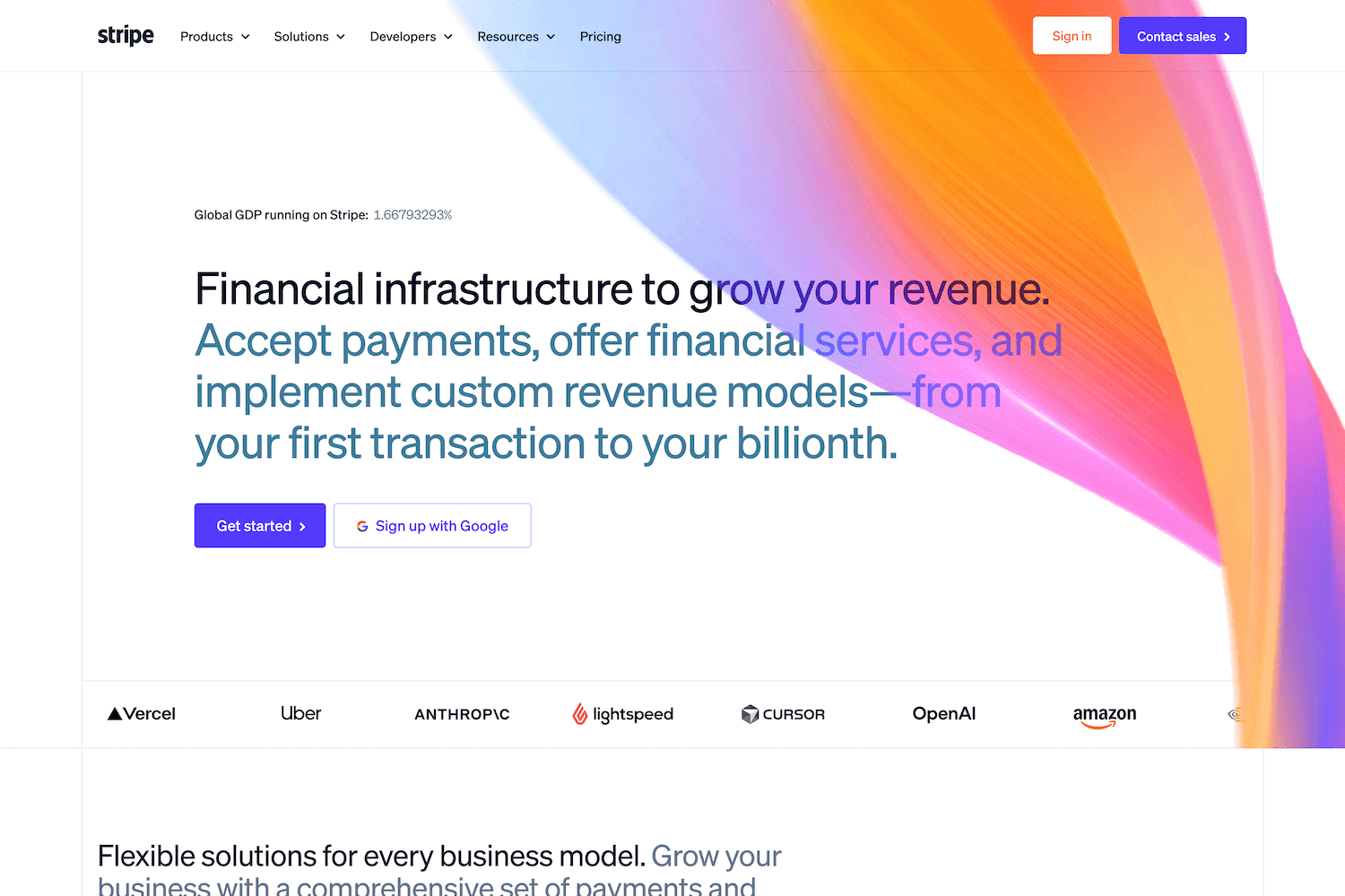
Stripe's homepage
One of the gold standards in the space, Stripe's recent redesign set a new benchmark for what a product marketing site can be. The design system is extremely consistent across every page, the development is best in class, and the overall experience feels more like a digital product than a marketing site.
What stands out is how Stripe balances density with clarity. The platform serves everything from solo developers to enterprise financial infrastructure, yet the site never feels overwhelming. Every section earns its place.
We highly recommend watching the YC Design Review episode with Katie Dill, Stripe's Head of Design, where she breaks down the redesign process and how the team approached craft in an AI era.
Framer
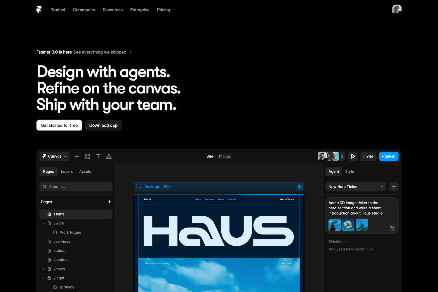
Framer's homepage
Framer's website is the best possible argument for its own product. Built entirely on their platform, it showcases what Framer is capable of through the experience of using the site itself. Smooth interactions, strong editorial feel, and a level of visual polish that makes the marketing site indistinguishable from a handcrafted build.
The homepage does an excellent job of communicating both simplicity (anyone can build) and depth (professionals choose this tool) without those messages contradicting each other.
Linear
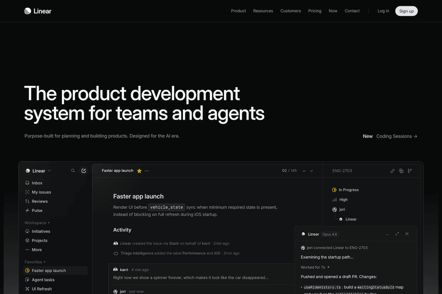
Linear's homepage
No list of great SaaS websites is complete without Linear. A true dark mode masterclass with the perfect balance between simplicity and a high level of craft. Every interaction feels intentional, every animation serves a purpose, and the overall experience is polished to a degree that very few SaaS companies achieve.
Linear's site proves that dark interfaces can feel warm and inviting rather than cold and heavy. The typography, spacing, and motion design work together seamlessly to create a sense of speed and precision that mirrors the product itself.
Ramp
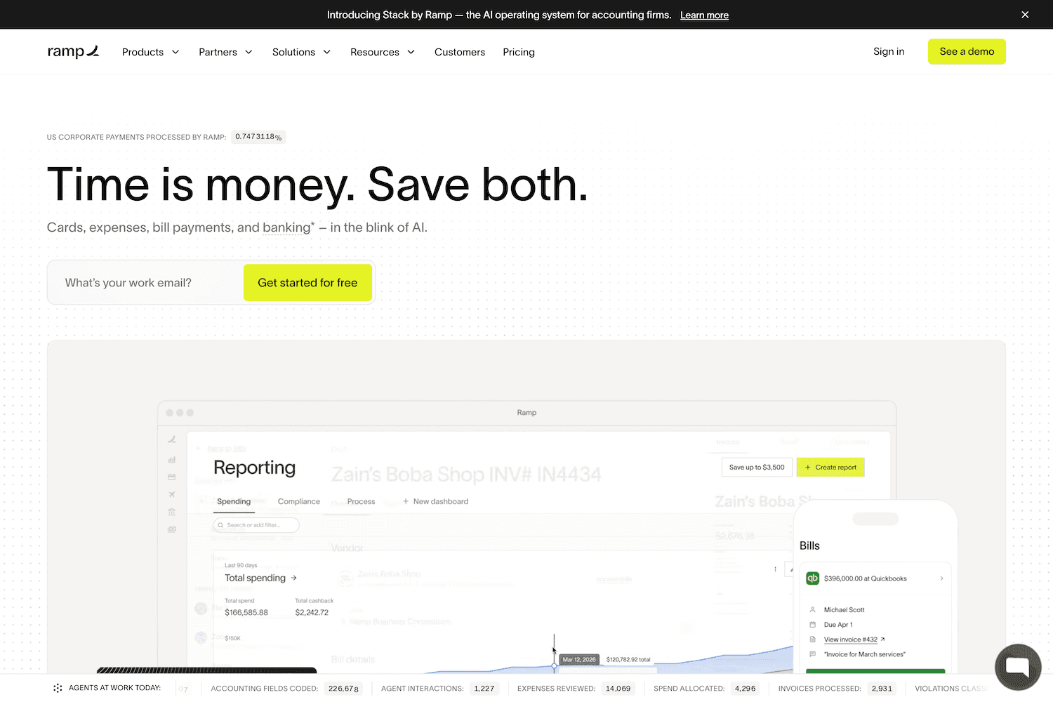
Ramp's homepage
Ramp is one of the strongest examples of a fintech site that makes a complex product feel simple. The design is clean and sharp, focused entirely on conversion, and the use of product UI as a visual asset throughout the site is extremely effective.
Rather than relying on abstract illustrations or stock photography, Ramp shows the actual product at every opportunity, taking advantage of their distinctive accent color.
Clerk
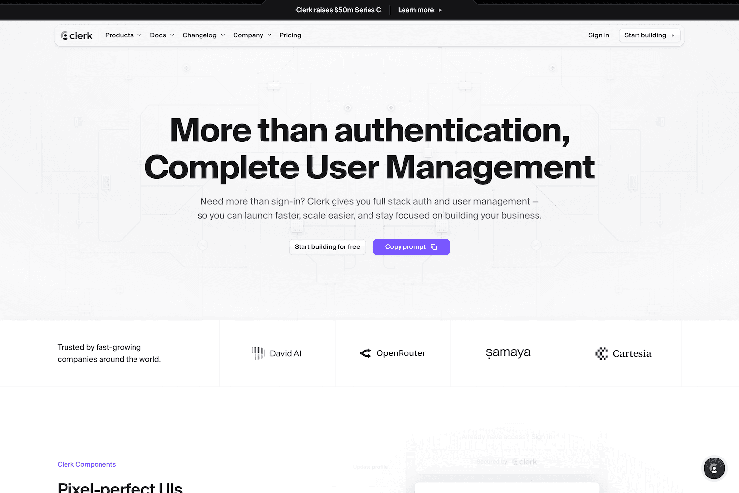
Clerk's homepage
Clerk's site is a strong example of developer-focused design done right. The product is technical (authentication and user management), but the site communicates its value without requiring deep technical knowledge to understand.
The design system feels cohesive across every page, from the homepage to the docs. That consistency signals a mature product even for a relatively young company.
Dub
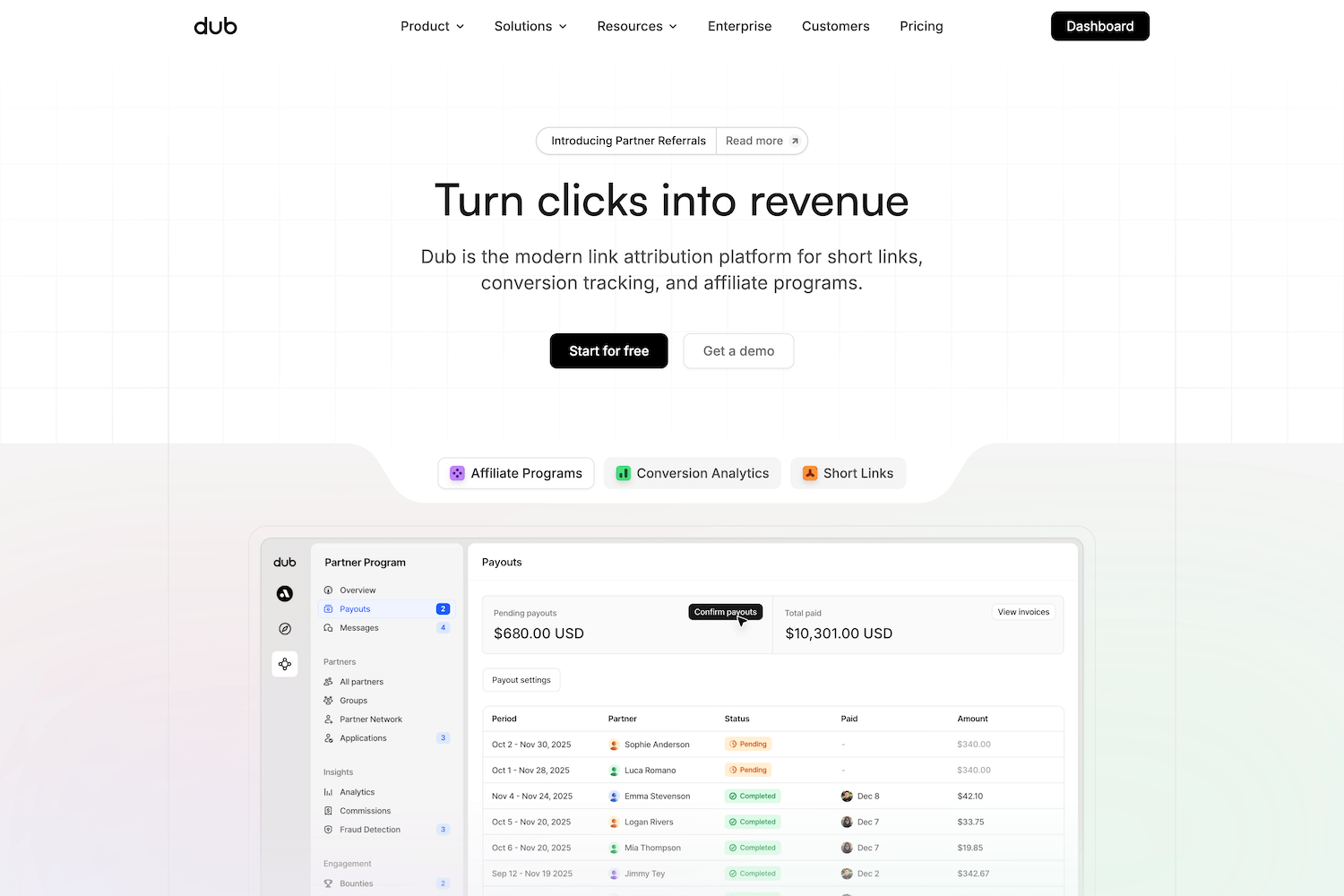
Dub's homepage
Dub proves that a content-rich homepage can still feel clean and effortless. The site covers a lot of ground, from product demos to enterprise infrastructure, but the minimal yet well-crafted design keeps everything easy to navigate.
The hero communicates exactly what the product does in seconds, and uses subtle color coding to differentiate their product's use cases.
V7 Labs
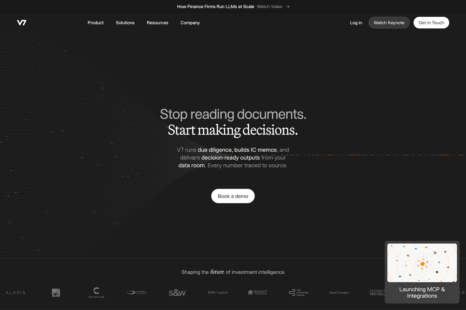
V7 Labs' homepage
V7's site does what every complex product struggles with: it makes a deeply technical AI platform feel accessible. Paired with a beautiful design system, the homepage is structured around real use cases rather than abstract capabilities, which immediately grounds the product in practical value.
Strong metrics placement, clear social proof from recognizable brands, and product visibility that gives the visitor a real sense of how the platform works. A great example of how to communicate depth without overwhelming the visitor.
Peec AI
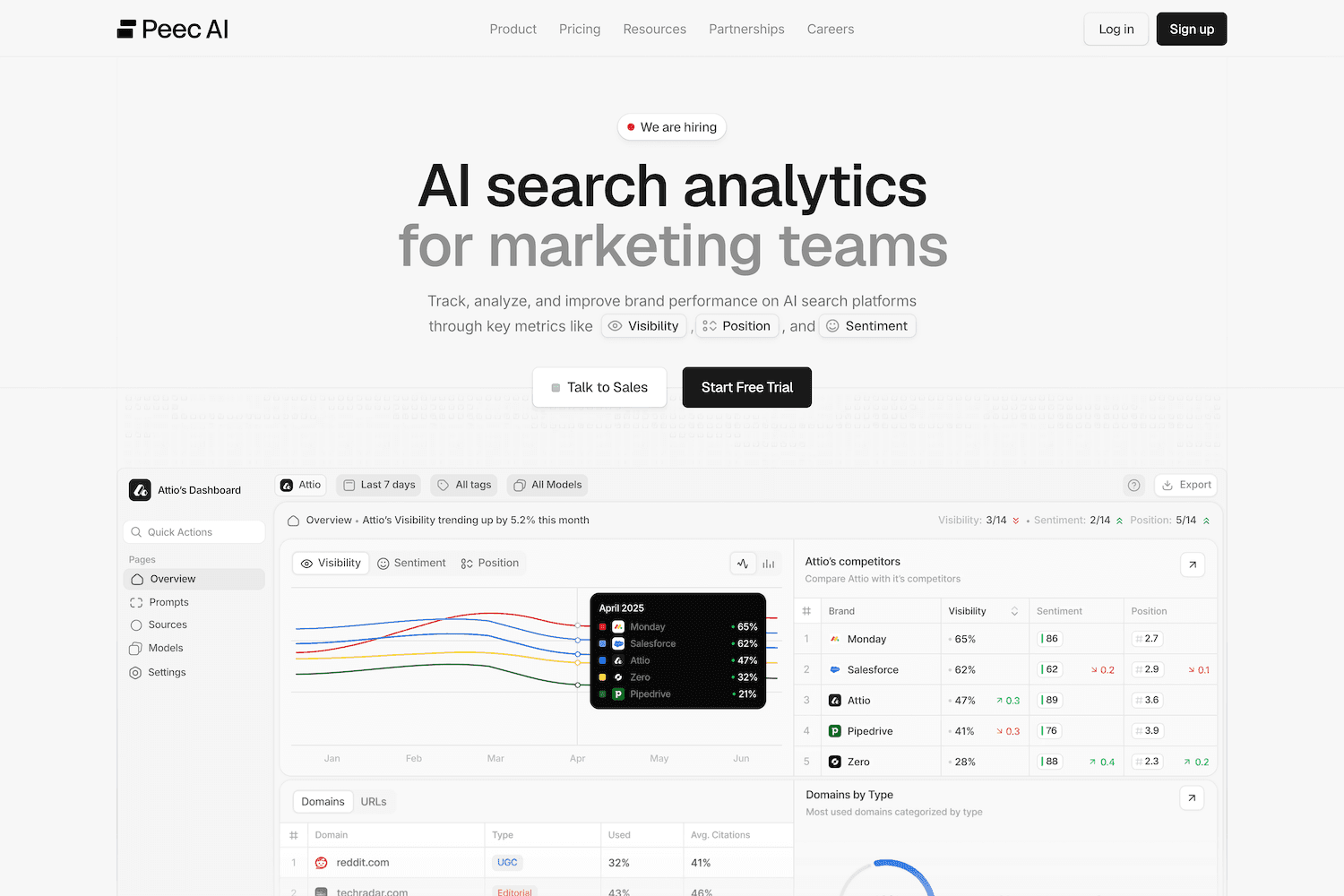
Peec AI's homepage
Peec AI is a great example of a young company that looks established through design alone. The hero immediately tells you what the product does and who it is for with zero ambiguity, and carries strong social proof from their different customer profiles.
The light, clean aesthetic feels intentional rather than default, and the overall site punches well above what you would expect from a company at this stage.
Cal.com
Cal.com's homepage
Cal.com's site matches its product philosophy: transparent, fast, and no-nonsense. As an open-source scheduling platform, the site communicates its core differentiator (open-source alternative to Calendly) immediately and lets the product speak for itself.
A good example of how restraint and clarity can be more compelling than a heavy design investment. The site is simple because the product is simple, and that alignment between product and presentation builds trust.
Giga

Giga's homepage
Giga has one of the most distinctive hero sections in this entire list. The nature photography is a bold departure from the typical dark UI or gradient approach, and it works because it reinforces the brand's message: human, natural, conversational.
The typography is elegant without being decorative, and the overall art direction proves that a SaaS site can have real creative vision and still communicate clearly.
Frequently asked questions
What makes a good SaaS website?
Clarity, product visibility, strong trust signals, and restraint. The best SaaS websites communicate what the product does immediately, show it in action, build credibility through specific proof points, and leave out anything that does not serve the visitor.
How often should a SaaS company redesign its website?
There is no fixed timeline. The trigger should be a meaningful change in the product, positioning, or audience, not a calendar date. Some companies redesign annually, others keep the same site for years because it still works.
Does website design actually affect SaaS conversions?
Yes. Design shapes how visitors perceive a product before they ever use it. A well-structured, clearly written site with strong product visibility builds trust and reduces friction in the decision-making process.
Should a SaaS website show the product or use illustrations?
Showing the actual product is almost always more effective. Visitors want to understand what they are signing up for. Abstract illustrations can support the narrative, but they should not replace product visibility.
What pages should a SaaS website include?
At minimum: homepage, product or features, pricing (if applicable), about, and contact. Blog, careers, and additional pages depend on the company's stage and needs. Check our recent guide on How to Structure a SaaS Marketing Website.
A great SaaS website does not just look good. It communicates a complex product with clarity, builds trust quickly, and guides visitors toward a decision. The best ones make that look effortless.
This is a curated list of SaaS websites we think are worth studying in 2026. Not because they follow trends, but because each one solves a real communication problem in a way that feels intentional, clear, and well-crafted.
The fundamentals
Before the list, a few patterns worth noting. The best SaaS websites tend to share a handful of qualities that set them apart.
Clarity above everything. The visitor understands what the product does within seconds. No jargon, no vague promises, no clever taglines that require interpretation. The value proposition is specific and immediate.
Product visibility. Screenshots, demos, videos, or interactive elements that show the product in action. The visitor should be able to understand what using the product looks like without signing up or booking a call.
Intentional motion and pacing. The best sites use motion to guide attention, not to decorate. Scroll-triggered animations, micro-interactions, and transitions that serve the narrative rather than distract from it.
Trust signals that feel earned. Customer logos, metrics, and testimonials that are specific and believable. One testimonial with a concrete outcome is worth more than a wall of generic praise.
Restraint. Strong sites know what to leave out. No feature dumps, no pages that exist just to fill the navigation, no sections that repeat what was already said. Every element earns its place.
Stripe
Stripe's homepage
One of the gold standards in the space, Stripe's recent redesign set a new benchmark for what a product marketing site can be. The design system is extremely consistent across every page, the development is best in class, and the overall experience feels more like a digital product than a marketing site.
What stands out is how Stripe balances density with clarity. The platform serves everything from solo developers to enterprise financial infrastructure, yet the site never feels overwhelming. Every section earns its place.
We highly recommend watching the YC Design Review episode with Katie Dill, Stripe's Head of Design, where she breaks down the redesign process and how the team approached craft in an AI era.
Framer
Framer's homepage
Framer's website is the best possible argument for its own product. Built entirely on their platform, it showcases what Framer is capable of through the experience of using the site itself. Smooth interactions, strong editorial feel, and a level of visual polish that makes the marketing site indistinguishable from a handcrafted build.
The homepage does an excellent job of communicating both simplicity (anyone can build) and depth (professionals choose this tool) without those messages contradicting each other.
Linear
Linear's homepage
No list of great SaaS websites is complete without Linear. A true dark mode masterclass with the perfect balance between simplicity and a high level of craft. Every interaction feels intentional, every animation serves a purpose, and the overall experience is polished to a degree that very few SaaS companies achieve.
Linear's site proves that dark interfaces can feel warm and inviting rather than cold and heavy. The typography, spacing, and motion design work together seamlessly to create a sense of speed and precision that mirrors the product itself.
Ramp
Ramp's homepage
Ramp is one of the strongest examples of a fintech site that makes a complex product feel simple. The design is clean and sharp, focused entirely on conversion, and the use of product UI as a visual asset throughout the site is extremely effective.
Rather than relying on abstract illustrations or stock photography, Ramp shows the actual product at every opportunity, taking advantage of their distinctive accent color.
Clerk
Clerk's homepage
Clerk's site is a strong example of developer-focused design done right. The product is technical (authentication and user management), but the site communicates its value without requiring deep technical knowledge to understand.
The design system feels cohesive across every page, from the homepage to the docs. That consistency signals a mature product even for a relatively young company.
Dub
Dub's homepage
Dub proves that a content-rich homepage can still feel clean and effortless. The site covers a lot of ground, from product demos to enterprise infrastructure, but the minimal yet well-crafted design keeps everything easy to navigate.
The hero communicates exactly what the product does in seconds, and uses subtle color coding to differentiate their product's use cases.
V7 Labs
V7 Labs' homepage
V7's site does what every complex product struggles with: it makes a deeply technical AI platform feel accessible. Paired with a beautiful design system, the homepage is structured around real use cases rather than abstract capabilities, which immediately grounds the product in practical value.
Strong metrics placement, clear social proof from recognizable brands, and product visibility that gives the visitor a real sense of how the platform works. A great example of how to communicate depth without overwhelming the visitor.
Peec AI
Peec AI's homepage
Peec AI is a great example of a young company that looks established through design alone. The hero immediately tells you what the product does and who it is for with zero ambiguity, and carries strong social proof from their different customer profiles.
The light, clean aesthetic feels intentional rather than default, and the overall site punches well above what you would expect from a company at this stage.
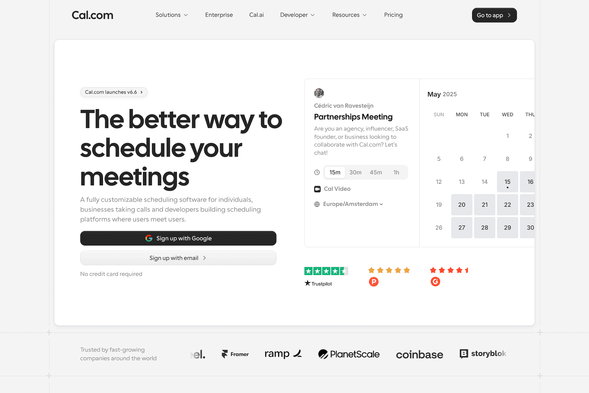
Cal.com
Cal.com's homepage
Cal.com's site matches its product philosophy: transparent, fast, and no-nonsense. As an open-source scheduling platform, the site communicates its core differentiator (open-source alternative to Calendly) immediately and lets the product speak for itself.
A good example of how restraint and clarity can be more compelling than a heavy design investment. The site is simple because the product is simple, and that alignment between product and presentation builds trust.
Giga
Giga's homepage
Giga has one of the most distinctive hero sections in this entire list. The nature photography is a bold departure from the typical dark UI or gradient approach, and it works because it reinforces the brand's message: human, natural, conversational.
The typography is elegant without being decorative, and the overall art direction proves that a SaaS site can have real creative vision and still communicate clearly.
Frequently asked questions
What makes a good SaaS website?
Clarity, product visibility, strong trust signals, and restraint. The best SaaS websites communicate what the product does immediately, show it in action, build credibility through specific proof points, and leave out anything that does not serve the visitor.
How often should a SaaS company redesign its website?
There is no fixed timeline. The trigger should be a meaningful change in the product, positioning, or audience, not a calendar date. Some companies redesign annually, others keep the same site for years because it still works.
Does website design actually affect SaaS conversions?
Yes. Design shapes how visitors perceive a product before they ever use it. A well-structured, clearly written site with strong product visibility builds trust and reduces friction in the decision-making process.
Should a SaaS website show the product or use illustrations?
Showing the actual product is almost always more effective. Visitors want to understand what they are signing up for. Abstract illustrations can support the narrative, but they should not replace product visibility.
What pages should a SaaS website include?
At minimum: homepage, product or features, pricing (if applicable), about, and contact. Blog, careers, and additional pages depend on the company's stage and needs. Check our recent guide on How to Structure a SaaS Marketing Website.
We partner with SaaS teams to create design that matches the quality of the products behind them.

