How to Structure a SaaS Marketing Website
The pages you include, the content within them, and what you leave out all shape how visitors understand your product and decide whether to take action.

9 min read
Copy URL
Copied!
Every SaaS marketing website needs to answer the same basic questions: what does this product do, who is it for, why should I trust the company behind it, and what do I do next. The difference between a site that converts and one that doesn't usually comes down to how clearly and efficiently it answers those questions.
The structure of your site is not a creative exercise. It is a strategic one. The pages you build, the information hierarchy within each page, and the paths you create between them determine whether a visitor leaves with clarity or confusion.
Homepage
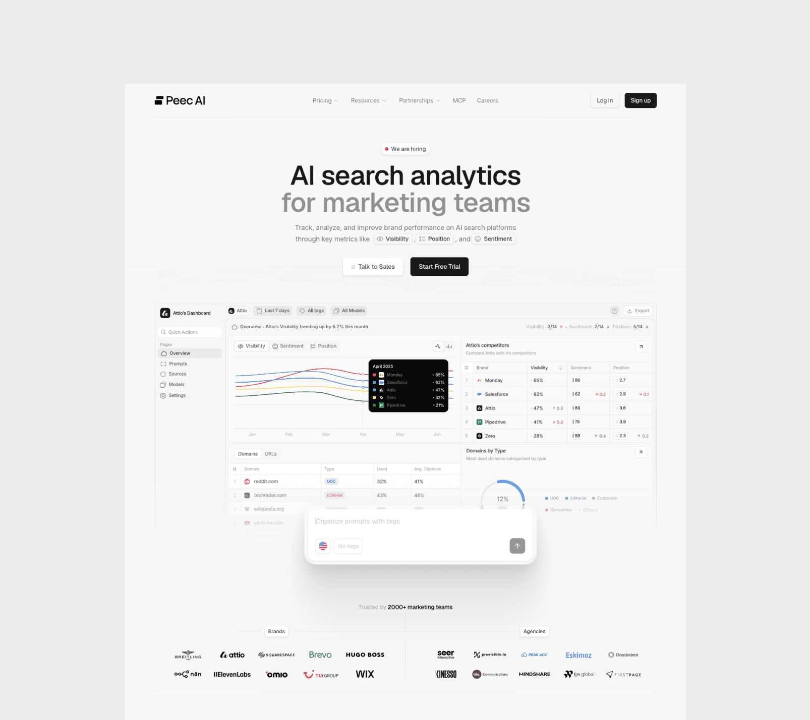
The homepage is typically the most important page on your website. And within it, the hero is the single most important section. If a visitor cannot understand what problem you're solving within seconds of landing, everything below it becomes irrelevant.
Most visitors scan before they commit to reading. Your homepage copy needs to be focused, clear, and concise. Short sentences, sharp headlines and no walls of text. A strong SaaS homepage answers three questions above the fold: what the product does, who it is for, and why it matters. Everything below the fold exists to build on that foundation with proof, context, and a clear path forward.
What to include
Hero section. A clear value proposition, a supporting line that adds specificity, and one primary call to action. This is not the place for feature lists or clever taglines, use plain language.
Social proof. Customer logos, recognizable brands, or a short line like "trusted by 500+ teams." This needs to appear early, ideally in the hero itself if there's room or right after.
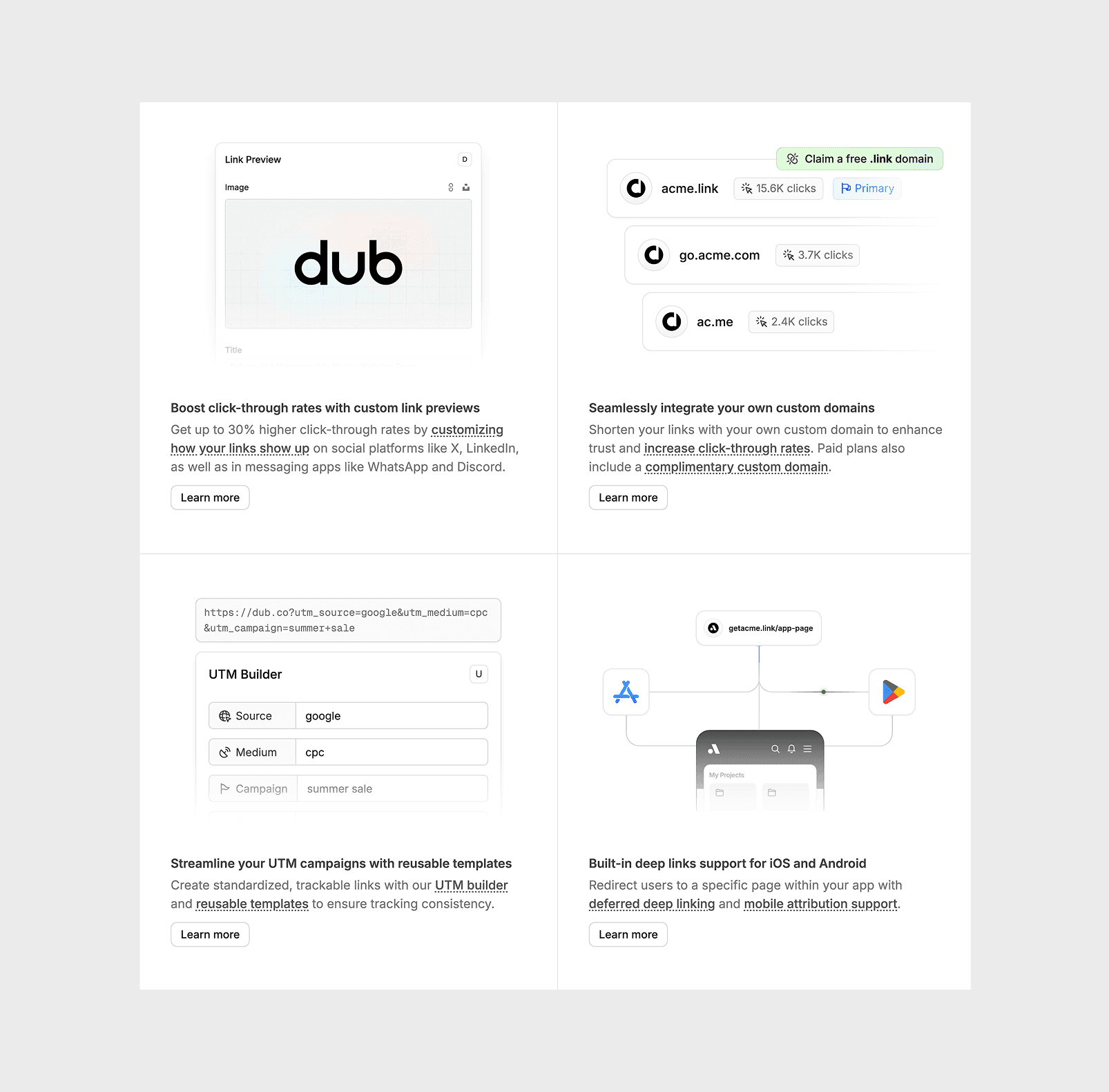
Product features. Screenshots, a short video, or an interactive demo that shows the product in action. Visitors should be able to understand what using the product looks like without requesting a demo. Motion and interactive elements can be especially effective here.
Key benefits. Two to four core benefits, framed around outcomes rather than features. "Reduce review cycles by 40%" is stronger than "collaboration tools."
Testimonials. Specific, outcome-driven quotes from real customers. One strong testimonial with a measurable result is more effective than five generic ones.
Final CTA. Repeat the primary call to action at the bottom. Visitors who scrolled the entire homepage are your most engaged audience.
What to avoid
Trying to say everything. The homepage should make the visitor want to learn more, not overwhelm them with every detail. If a section doesn't directly build trust or clarify the value proposition, it probably belongs on another page or not on the site at all.
Product or features
This is where you go deeper on what the product actually does. The key is organization: structure this page by use case or problem, not by feature name.
Explaining a complex product with simplicity, without stripping away what makes it powerful, is one of the hardest things to get right on a SaaS site. A visitor reading "Automated invoice processing" understands the value immediately. A visitor reading "InvoiceAI Pro Module" does not. Every feature should be connected to a tangible outcome.
Show, don't describe
Product visuals matter on this page. Screenshots with context, short video demos, or animated walkthroughs help visitors understand the product far more effectively than text descriptions alone.
A 30-second product walkthrough can communicate more than an entire page of copy. The visual quality of these assets also signals how seriously the company takes its product.
Avoid the feature dump
Listing every feature with a checkmark and a one-line description is the SaaS equivalent of a spec sheet. It gives the visitor information without meaning. Group features by the problem they solve and explain why each one matters to the user, not just what it does.
Pricing
Pricing is one of the highest-intent pages on any SaaS site. Visitors who land here are actively evaluating whether to take action.
Two approaches
How you handle pricing depends on your sales model and how you charge customers.
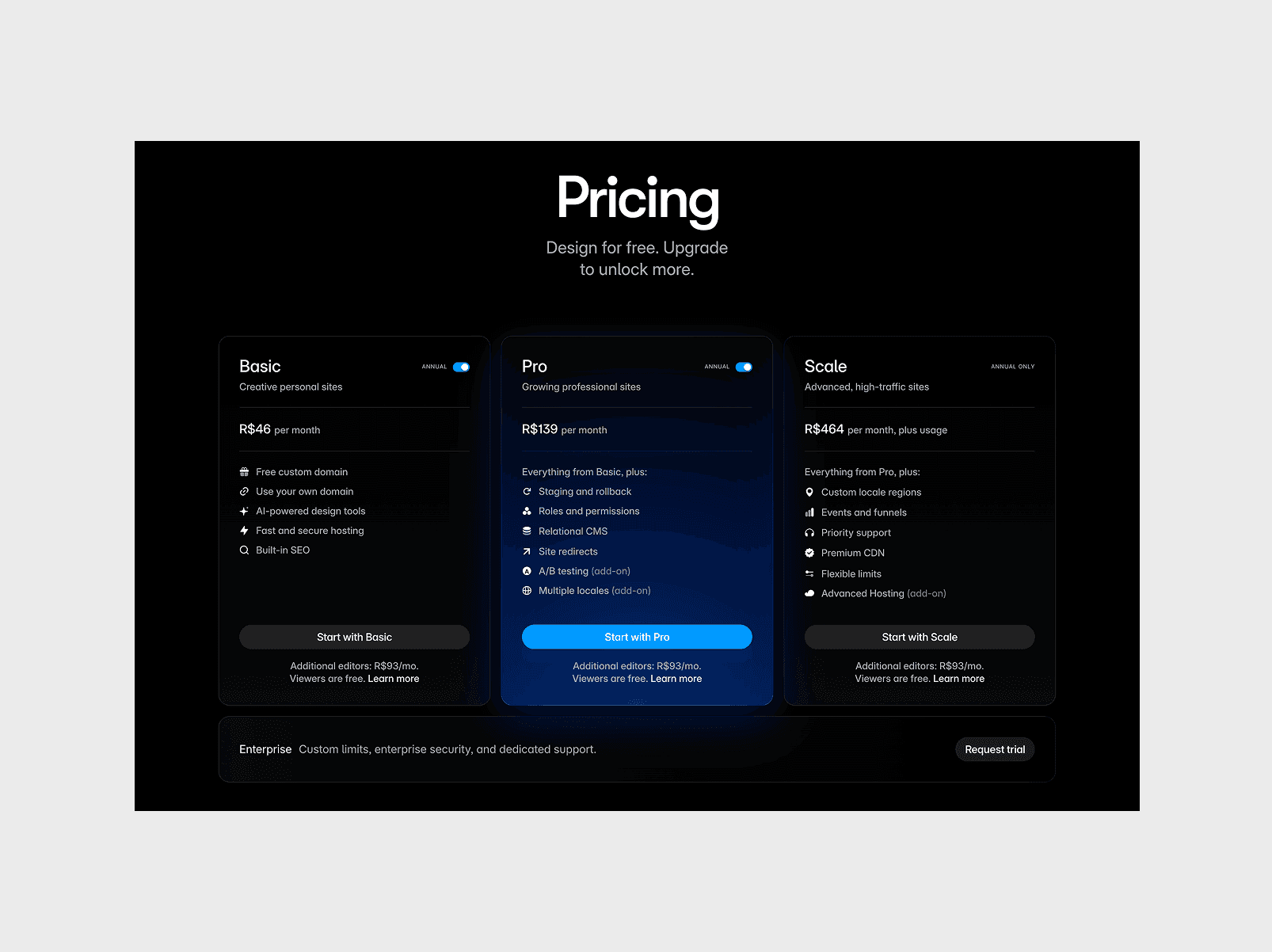
Transparent pricing works well when your product has a clear, self-serve path to purchase. Tiered plans with visible prices, feature breakdowns, and a free trial or signup CTA. This builds trust, filters unqualified leads, and reduces friction for buyers who are ready to act.
Gated pricing ("Contact sales" or "Book a demo") is a legitimate strategy when your product has complex, usage-based, or enterprise-level pricing that varies by customer. It also works when your sales team converts better through conversation, where they can tailor the pitch and handle objections in real time.
The key is making it a deliberate choice, not a default. If your plans are simple and your competitors show theirs, hiding that information can push buyers toward the company that was transparent first.
What to include either way
If you show pricing, include a clear comparison of what each plan includes and an FAQ that addresses common objections: cancellation, free trials, what happens when you outgrow your plan.
If pricing is fully gated, you probably don't need a dedicated pricing page at all. The call to action lives directly on your homepage and product pages. What matters is that the next step is always clear, regardless of the model.
About
The About page is often more influential than founders realize, especially in B2B and SaaS. When buyers are evaluating a product, they are also assessing the company behind them.
For a startup with limited brand recognition, this page is a credibility multiplier. It is your chance to answer the question every visitor is quietly asking: who is behind this, and can I trust them?
What to include
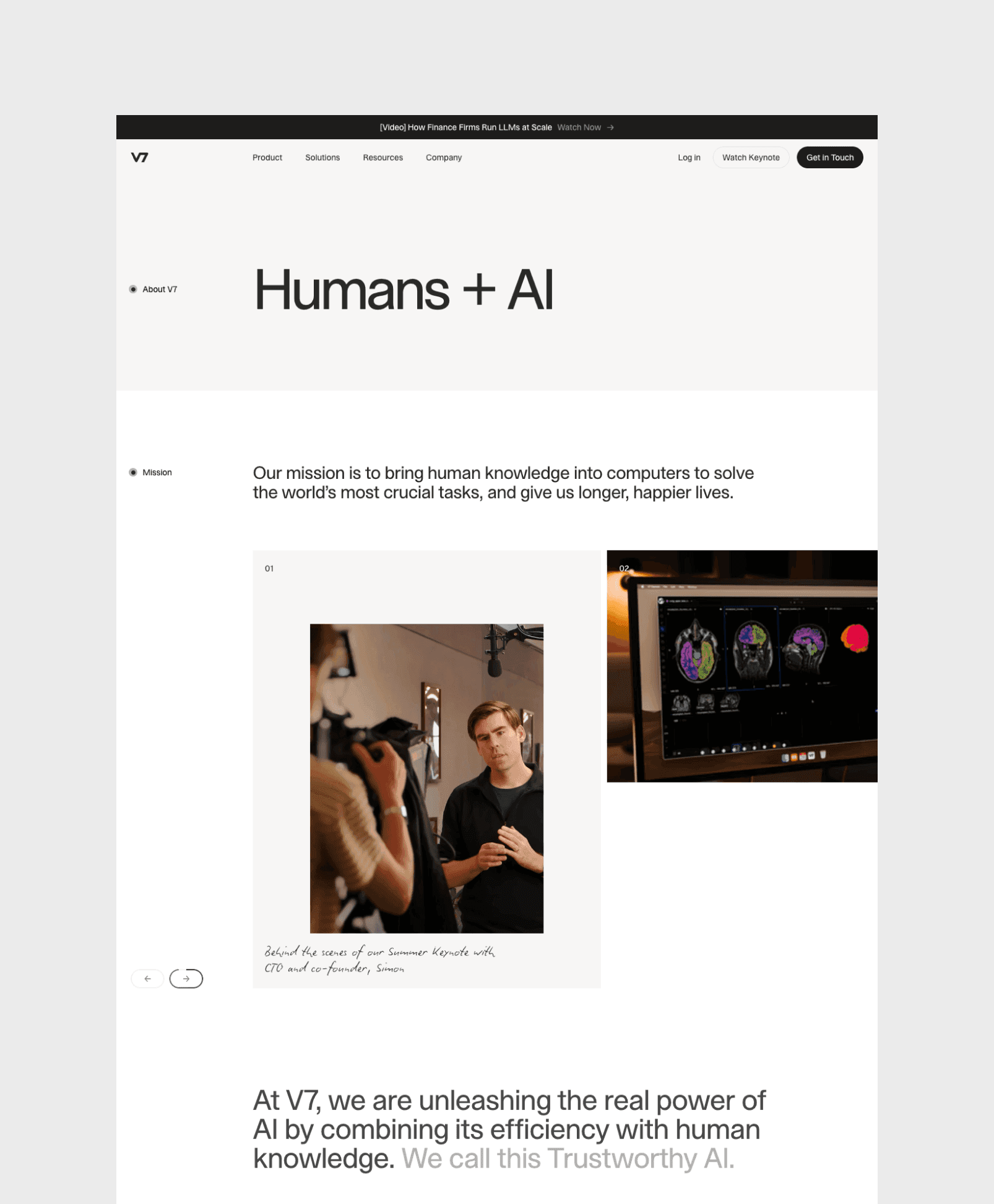
The company story. Not a corporate timeline. A short, honest narrative about why the company exists and what problem it was created to solve. This is a chance to make a statement about what you believe and how you approach the market differently.
The team. Photos and brief bios of the founders and key team members. For early-stage startups, this is often the strongest credibility signal on the entire site.
Investors and backers. If you have raised funding from recognizable names, show them. This is social proof that speaks directly to credibility.
Values or mission. Only if they are specific and authentic. "We believe in innovation" says nothing. "We believe enterprise software should be as intuitive as consumer software" says something.
What to avoid
Generic corporate language that could apply to any company. If you remove your company name and the About page still makes sense for ten other startups, it is not specific enough.
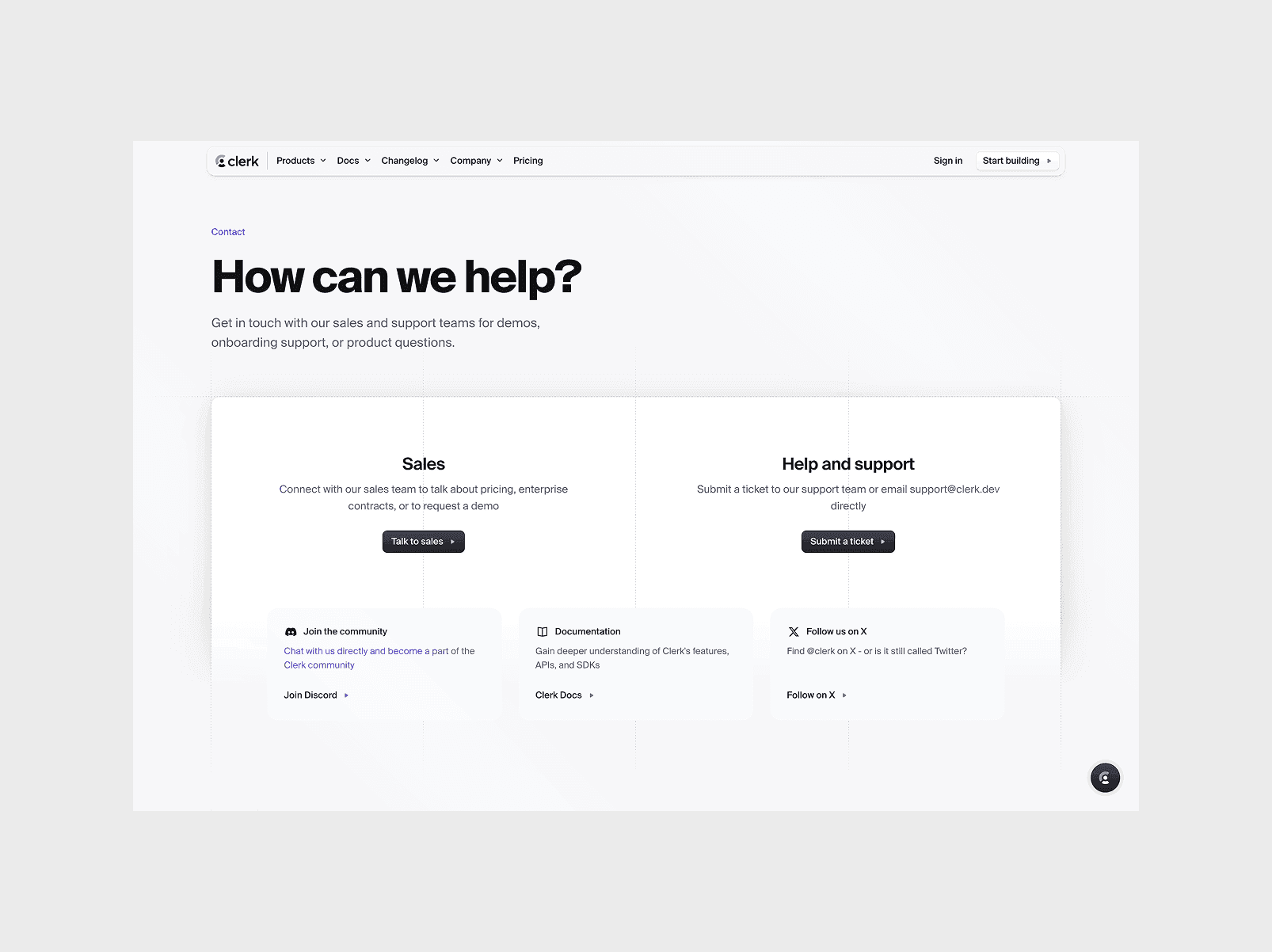
Contact
The contact page should do one thing: make it easy for the right people to reach you.
One primary action. For most SaaS startups, this is "Book a demo" or "Get in touch." A short form with only the fields you actually need. Every additional field reduces completion rates.
What undermines this page: a wall of text explaining your process before the visitor can find the form, multiple competing CTAs, or a form with fifteen fields that feels like a job application. The contact page is a conversion point, not a content page.
Blog
A blog is one of the most effective long-term acquisition channels for SaaS, but it only works if the content is genuinely useful and you can commit to publishing consistently.
If you are not ready for that, skip it. A clean site with no blog is better than a site with an abandoned one. Three posts from eight months ago signals that the company started something and couldn't follow through. Add a blog when you can sustain it.
Careers
If you are actively hiring, a careers page is worth building. Candidates research companies before applying, and your website shapes part of that first impression.
A thoughtful careers page can reinforce credibility, communicate culture, and help the right people self-select into the hiring process. Open roles with clear descriptions and a short section about the team is enough.
If you are early stage or not actively hiring, skip this page. You can always add it later when the team starts growing.
Final thoughts
The strongest SaaS websites turn complex ideas into an effortless experience that naturally guides the visitor to take action. Every page has a purpose and nothing exists just to fill the navigation.
The companies that get this right are the ones that understand what their visitor needs to know, in what order, and at what depth. Structure is not a design decision, it is a strategic one. Get it right and your website becomes your most effective salesperson.
Frequently asked questions
How many pages should a SaaS marketing website have?
There is no fixed number. A typical early-stage SaaS site has five to seven core pages: home, product, pricing, about, blog, contact, and possibly careers. What matters is that every page has a clear purpose and earns its place in the navigation.
Should a SaaS startup show pricing on the website?
It depends on your sales model. If your pricing is straightforward, showing it publicly builds trust and filters leads. If your sales process works better through conversation or your pricing varies by customer, gating it is a valid strategy. What matters is that it's a deliberate choice, not a default.
What is the most important page on a SaaS website?
The homepage. It is where the majority of visitors land first and where they decide whether to continue exploring. A clear value proposition and strong social proof on the homepage set the tone for the rest of the site.
Does a SaaS startup need a blog?
Only if you can commit to publishing consistently with content tied to real search intent. A well-maintained blog is one of the highest-ROI marketing investments for SaaS. A neglected blog with a few old posts does more harm than good.
We work with fast-growing SaaS startups to build digital interfaces that match their ambition.

