What Investors Look for on a Startup Website
Investors check your website before every meeting, and most startup sites are quietly killing deals before the conversation even starts.

5 min read
Copy URL
Copied!
After an initial introduction, whether through a deck, a referral, or a cold outbound, investors will almost always visit a startup’s website.
In a short scan, they look for indicators of clarity, focus, and execution quality. These are not arbitrary. They reflect how well a company understands its product, market, and growth.
In a previous article, we explored how your website shapes investor perception. Here, we break down what investors are actually looking for, and how it shows up in practice.
1. Immediate clarity
The first test is simple: can they understand what the company does without effort?
This is not about clever wording. It is about precision. A strong homepage answers three questions without scrolling: what does the product do, who is it for, and why does it matter. If any of these are unclear, the rest of the site becomes harder to interpret and most investors will not do the work to figure it out.
The most common mistakes are vague phrases like "empowering teams" or "intelligent solutions", trying to speak to multiple audiences at once, and overloading the hero with too much information. Clarity is not about saying more, it is about saying the right thing.
2. Proof of traction
Once the value proposition lands, investors look for signals that the company has traction or legitimacy. This does not require scale. Even early-stage companies can show credibility through customer logos, specific testimonials, relevant metrics, or press mentions.
What matters is believability, not volume. A single testimonial with a specific outcome is more effective than five generic ones. Proof elements that feel disconnected from the rest of the page create more doubt than they resolve.
A few examples include:
Customer logos or recognizable brands
Testimonials with specific outcomes
Metrics (if available)
Press mentions or partnerships
3. Product visibility
Investors should be able to understand what the product looks like, how it is used, and what problem it solves in practice without a demo call. Product screenshots with context, short walkthroughs, or videos tied to real use cases all work. The goal is not to show everything. It is to remove ambiguity.
The most common mistake is describing the product abstractly without showing it. If the only way to understand the product is to request a demo, that friction works against you.
4. Consistency with the pitch
A website is often evaluated alongside the pitch deck. Investors expect both to tell the same story: same positioning, same target audience, same key messaging. Any inconsistency creates friction.
If the deck positions the company as a developer-focused tool but the website speaks broadly to "teams", it introduces doubt. The two documents should feel like they came from the same company, because they did.
5. Signals of focus
Strong companies feel focused. This shows up in how the site is structured: a clear primary audience, a defined use case, a site that is not trying to do everything at once. Multiple competing messages, too many navigation paths, and broad appeals to everyone signal that the company has not clearly defined its market.
Focus is not a design decision. It is a strategic one. But it shows up in design.
What investors look for:
A clear primary audience
A defined use case
A site that is not trying to do everything at once
What weak focus looks like:
Multiple competing messages
Too many navigation paths
Trying to appeal to everyone
Focus signals that the company understands its market.
6. Execution quality
Design and structure are not judged as aesthetics. They are interpreted as a proxy for how the company operates. A well-structured website suggests attention to detail, understanding of user behavior, and an ability to communicate clearly. A poorly executed one suggests the opposite.
Visual hierarchy, spacing, readability, consistency across sections, and performance on mobile all contribute to this impression. It is not about making something look pretty. It is about whether the company can execute on the details.
7. A clear next step
Even for investors who are not yet ready to engage, clarity in action matters. One primary call to action, with clear paths depending on intent, reflects a focused business. Multiple competing calls to action, or no clear direction at all, dilute attention and signal a lack of clarity about what you actually want visitors to do.
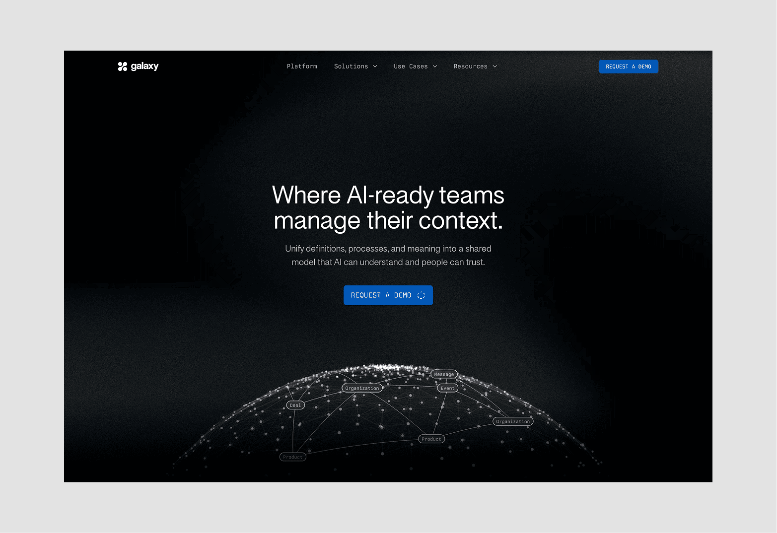
Galaxy's homepage
Putting it together
Investors are not evaluating your website as a design project. They are using it as a proxy for how your company operates. In a short visit, they are looking for clarity, credibility, focus, and execution quality. A strong website makes these signals obvious. A weak one makes them harder to see and in most cases, investors will not do the work to look harder.
Frequently asked questions
Do investors really care about a startup’s website?
Yes. While the pitch deck is the primary document, the website is often used to validate first impressions and understand the company more quickly.
What is the most important part of a startup website?
The value proposition. If an investor cannot quickly understand what the company does and why it matters, the rest of the site becomes less effective.
Do early-stage startups need a polished website?
Yes, not necessarily polished, but clear. Even simple websites can perform well if they communicate positioning and product clearly.
How much information should a startup website include?
Enough to remove ambiguity, but not so much that it becomes difficult to navigate. Clarity is more important than volume.
Can a bad website hurt fundraising?
Yes. While it may not be the sole reason for rejection, it can introduce doubt and reduce confidence, especially when combined with other signals.
After an initial introduction, whether through a deck, a referral, or a cold outbound, investors will almost always visit a startup’s website.
In a short scan, they look for indicators of clarity, focus, and execution quality. These are not arbitrary. They reflect how well a company understands its product, market, and growth.
In a previous article, we explored how your website shapes investor perception. Here, we break down what investors are actually looking for, and how it shows up in practice.
1. Immediate clarity
The first test is simple: can they understand what the company does without effort?
This is not about clever wording. It is about precision. A strong homepage answers three questions without scrolling: what does the product do, who is it for, and why does it matter. If any of these are unclear, the rest of the site becomes harder to interpret and most investors will not do the work to figure it out.
The most common mistakes are vague phrases like "empowering teams" or "intelligent solutions", trying to speak to multiple audiences at once, and overloading the hero with too much information. Clarity is not about saying more, it is about saying the right thing.
2. Proof of traction
Once the value proposition lands, investors look for signals that the company has traction or legitimacy. This does not require scale. Even early-stage companies can show credibility through customer logos, specific testimonials, relevant metrics, or press mentions.
What matters is believability, not volume. A single testimonial with a specific outcome is more effective than five generic ones. Proof elements that feel disconnected from the rest of the page create more doubt than they resolve.
A few examples include:
Customer logos or recognizable brands
Testimonials with specific outcomes
Metrics (if available)
Press mentions or partnerships
3. Product visibility
Investors should be able to understand what the product looks like, how it is used, and what problem it solves in practice without a demo call. Product screenshots with context, short walkthroughs, or videos tied to real use cases all work. The goal is not to show everything. It is to remove ambiguity.
The most common mistake is describing the product abstractly without showing it. If the only way to understand the product is to request a demo, that friction works against you.
4. Consistency with the pitch
A website is often evaluated alongside the pitch deck. Investors expect both to tell the same story: same positioning, same target audience, same key messaging. Any inconsistency creates friction.
If the deck positions the company as a developer-focused tool but the website speaks broadly to "teams", it introduces doubt. The two documents should feel like they came from the same company, because they did.
5. Signals of focus
Strong companies feel focused. This shows up in how the site is structured: a clear primary audience, a defined use case, a site that is not trying to do everything at once. Multiple competing messages, too many navigation paths, and broad appeals to everyone signal that the company has not clearly defined its market.
Focus is not a design decision. It is a strategic one. But it shows up in design.
What investors look for:
A clear primary audience
A defined use case
A site that is not trying to do everything at once
What weak focus looks like:
Multiple competing messages
Too many navigation paths
Trying to appeal to everyone
Focus signals that the company understands its market.
6. Execution quality
Design and structure are not judged as aesthetics. They are interpreted as a proxy for how the company operates. A well-structured website suggests attention to detail, understanding of user behavior, and an ability to communicate clearly. A poorly executed one suggests the opposite.
Visual hierarchy, spacing, readability, consistency across sections, and performance on mobile all contribute to this impression. It is not about making something look pretty. It is about whether the company can execute on the details.
7. A clear next step
Even for investors who are not yet ready to engage, clarity in action matters. One primary call to action, with clear paths depending on intent, reflects a focused business. Multiple competing calls to action, or no clear direction at all, dilute attention and signal a lack of clarity about what you actually want visitors to do.
Galaxy's homepage
Putting it together
Investors are not evaluating your website as a design project. They are using it as a proxy for how your company operates. In a short visit, they are looking for clarity, credibility, focus, and execution quality. A strong website makes these signals obvious. A weak one makes them harder to see and in most cases, investors will not do the work to look harder.
Frequently asked questions
Do investors really care about a startup’s website?
Yes. While the pitch deck is the primary document, the website is often used to validate first impressions and understand the company more quickly.
What is the most important part of a startup website?
The value proposition. If an investor cannot quickly understand what the company does and why it matters, the rest of the site becomes less effective.
Do early-stage startups need a polished website?
Yes, not necessarily polished, but clear. Even simple websites can perform well if they communicate positioning and product clearly.
How much information should a startup website include?
Enough to remove ambiguity, but not so much that it becomes difficult to navigate. Clarity is more important than volume.
Can a bad website hurt fundraising?
Yes. While it may not be the sole reason for rejection, it can introduce doubt and reduce confidence, especially when combined with other signals.
We work with venture-backed startups to build web presences that match their ambition.

